
Most landing pages fail before a visitor even reads a word of copy. Not because the Google Ads or SEO Strategy is wrong, and not because the business isn’t good at what they do. They fail because the page is built backwards – that is, it’s designed to describe the business, when it should be designed to move a stranger from “who are these people?” to “call now” in under a minute.
We build a lot of these for clients, and the pattern is always the same. The businesses with the highest conversion rates aren’t the ones with the fanciest websites. They’re the ones who’ve nailed the structure. Every section earns its place, every section has a job, and nothing is sitting on the page just because “that’s what websites have.”
So let’s break down what that structure actually looks like, section by section, and why each one exists.
Start With The 5-Second Test
Before you touch a single section, understand the constraint you’re working with. Someone lands on your page – probably on their phone, probably mid-search, probably with an actual problem they need solved right now. A burst pipe. A business that’s underperforming. A decision they’ve been putting off.
You’ve got about five seconds to answer three questions for them: What do you do? Is this for me? What do I do next? If your hero section can’t answer those three things, nothing else on the page matters, because they’ve already bounced.
The Hero Section: Your One Shot
This is the section everyone gets wrong, usually by making it about the business instead of the visitor. “Welcome to XYZ Plumbing, servicing Melbourne since 2005” tells the visitor nothing about what’s in it for them.
A hero section that works has four parts. A headline that leads with the outcome, not the service name. “Hot water back on today” beats “Professional Hot Water Repairs” every time, because it’s specific and it’s about the result, not the category. A subheadline that names who it’s for and includes the actual offer – free callout, same-day service, whatever makes this business worth choosing right now. A CTA button that’s impossible to miss. And a trust bar sitting right under that button – your star rating, years in business, licensing, whatever removes doubt in half a second.
And please, use a real photo. Not a stock photo of a smiling tradie who’s never set foot in Melbourne. Your actual team, your actual van, your actual site. Stock photography is one of the fastest ways to lose trust on a local service page, and most visitors clock it instantly even if they couldn’t tell you why the page feels off.
Social Proof, Immediately
Don’t make people scroll for evidence that you’re legitimate. Your Google review score and count should sit high on the page, and it should be real – pulled live if you can manage it, not a screenshot from eighteen months ago.
Pair that with two or three testimonials that are specific. “Great service!” convinces nobody. “Called at 7am with a burst pipe, had someone on site by 9, fixed and gone by 11” convinces everyone, because it tells a story a visitor can picture themselves in. If you don’t have testimonials like that yet, that’s a sign to go collect some before you go much further with the rest of the page.
Name The Problem Before You Pitch The Solution
This bit gets skipped constantly. Before you launch into why you’re great, spend two or three sentences showing the visitor you understand exactly what they’re dealing with. Their specific frustration, in their language.
This isn’t filler. It’s what makes everything that follows land, because you’ve proven you understand their situation before you’ve asked them to trust you with it.
Differentiators That Aren’t Generic
“Quality service.” “Customer satisfaction guaranteed.” “We care about our customers.” Every competitor on the page one results says the exact same thing, which means it says nothing at all.
Run every differentiator through one test: could a competitor copy and paste this onto their own site and it’d still be true? If yes, it’s not a differentiator; it’s noise. What actually works is specific and provable – a guarantee no one else in your market offers, a response time you can back up, a certification that’s genuinely rare. Three to five of these, presented as scannable benefit statements rather than a wall of text.
Show The Process
People hesitate to reach out because they don’t know what happens after they do. Will someone call me back in five minutes or five days? Do I need to be home? Is there a hidden quote process that’s actually a sales pitch?
A simple three-to-five step breakdown – book, we assess, we fix, you’re covered – reduces that friction. It’s not there to impress anyone. It’s there to make saying yes feel low-risk.
Services And Features, With A CTA Straight After
List what you actually do, each with a one-line description that focuses on the outcome rather than the technical detail. Then put another CTA right after this section. This is one of the most common gaps we see – businesses put a CTA at the top and bottom of the page and nowhere in between, which means anyone who’s convinced halfway through has to scroll back up to act on it.
About Us, Kept Short
A couple of sentences on who’s actually behind the business, with real names and real experience, does more for trust than a long history of the company. Pair it with a genuine photo of the team, on location. This section isn’t for you to tell your story at length. It’s there so the visitor knows there are real people on the other end of that phone number.
Handle The Objections Before They’re Asked
A tight FAQ section – four to six questions – should tackle the things people are actually worried about. Price. Timing. Whether you service their area. What’s included and what isn’t. Skip the generic filler questions and go straight at the objections that are genuinely stopping people from calling.
Close With The Offer, Again
Your final section should restate the offer, repeat the CTA and phone number, and include a line that lowers the pressure – something like “no obligation, no pushy sales calls.” If you’ve got a genuine reason for urgency, a real seasonal window or limited capacity, use it.
Design And Copy Matter As Much As Structure
You can nail every section above and still lose the visitor if the page looks like every other AI-generated site with a purple gradient and a stock illustration of a handshake. Keep it simple: one strong font for headlines, one clean font for body copy, one brand colour, and one accent colour reserved only for your CTA buttons so it always means “click here.”
Write like you’re talking to one person, not a boardroom. Short sentences. Second person. Cut anything that sounds like it was written to fill space rather than say something. And build for mobile first, because that’s where most of your traffic and most of your urgency is coming from.
Bringing It All Together
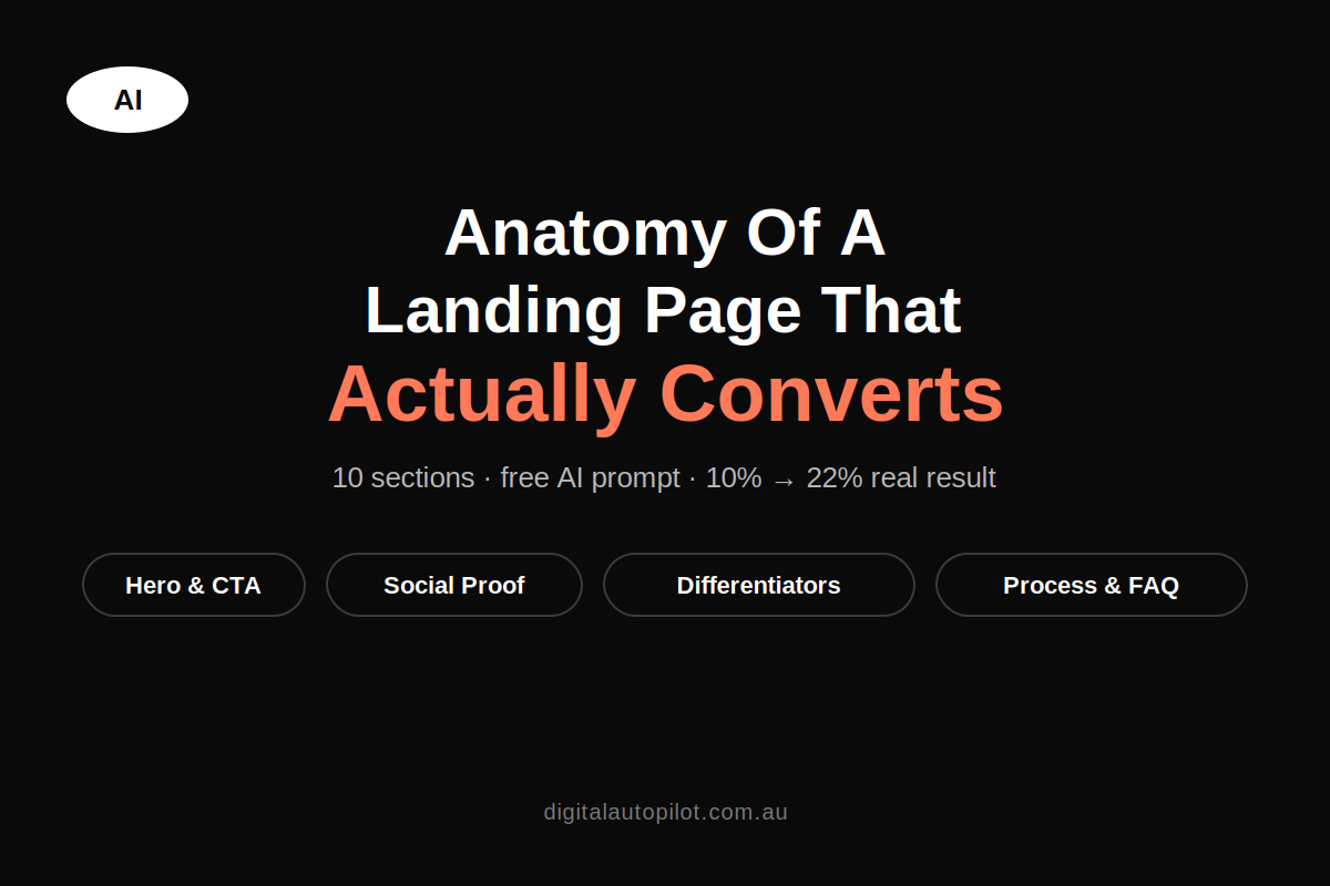
Here’s the thing: getting all of this right by hand, section by section, takes time most business owners don’t have. So we’ve put together a single prompt that pulls the entire structure above, plus the design and copy rules, into one document. Fill in the blanks about your business, hand it to an AI tool, and you’ll get a full first draft of your landing page built around everything we’ve just covered.
It won’t replace a proper strategy session or a skilled copywriter’s final polish. But it’ll get you a genuinely solid starting point, structured the right way from the first line.
Oh, and if you’re interested, this is a lightening-fast way to get it from the html based site that AI engines create into a wordpress page builder like Elementor in under 3 mins. Reach out if you’d like to know how.
The Landing Page Prompt
Fill in every bracketed input, then hand the whole thing to Claude (or another AI) in one go.
You are an expert conversion copywriter and web designer who has built high-converting landing pages for local service businesses. Write and structure a complete, ready-to-build landing page for the business below. Prioritise clarity and trust over cleverness — the visitor should understand what we do, why we’re credible, and what to do next within 5 seconds of landing. Design, copy, and structure should all work together toward that single goal.
Business Inputs
- Business name: [name]
- Service/offer: [what exactly are we selling – be specific, e.g. “emergency plumbing repairs” not “plumbing”]
- Location/service area: [suburbs/region]
- Target customer: [homeowner, business owner, etc. – include their pain point]
- Primary CTA action: [call now / book online / get a quote / free consultation]
- Compelling offer/hook: [discount, free inspection, guarantee, fast response time – the thing that makes THIS offer hard to ignore, not just “contact us”]
- Phone number / booking link: [insert]
- Years in business / jobs completed: [insert]
- Licences, certifications, insurance: [insert]
- 3–5 real differentiators: [what genuinely makes this business different – not generic claims like “quality service”]
- Pricing model: [transparent pricing / free quotes / financing available – whatever is true]
- Brand inputs: [brand colours (hex if known) / existing logo & fonts / a reference site you like / one you don’t]
- Tone of voice: [pick one and be specific — e.g. “warm and reassuring, like a trusted neighbour” / “direct and no-nonsense, speaks to time-poor tradies” / “premium and calm, speaks to homeowners spending $20k+”]
- Build target: [Elementor / WordPress / plain HTML – specify]
Design & Copy Ground Rules (apply to every section below)
- Visual style: avoid generic “AI startup” defaults – no purple-to-blue gradients, no glossy 3D blob illustrations, no generic rounded-corner SaaS look – unless that’s genuinely the brand fit. One strong display font for headlines, one clean readable font for body, max two font families. One primary brand colour, one accent colour reserved only for CTA buttons so it visually means “click me” and never appears decoratively elsewhere.
- Photography: real photos only — team on-site, vehicles, workspace, before/after shots. No stock photography. If a real photo isn’t available yet for a section, flag it as [PHOTO NEEDED – launch blocker, not optional] rather than filling it with a placeholder concept.
- Mobile-first: most traffic is a phone search with urgent intent, so the phone number/CTA must be reachable without scrolling on mobile (sticky header or floating call button). Whitespace and contrast over density — the page should scan in seconds.
- Voice: second person (“you,” “your home”), short sentences, short paragraphs, one idea per section. Headlines lead with the outcome, not the service name (e.g. “Hot water back on today” beats “Professional Hot Water Repairs”). Cut generic phrases any competitor could copy-paste (“quality service,” “customer satisfaction guaranteed”) — replace with something specific and provable.
- CTAs: name the action and the value, not just the action — “Get My Free Quote” beats “Submit”; “Call Now — Answered 24/7” beats “Contact Us.” Same button style throughout, large enough to tap on mobile, never the same colour as its section background.
- No fabrication: never invent testimonials, review counts, stats, or credentials. Mark every unverified spot as [PLACEHOLDER – replace with real asset].
Build the page with these sections, in this order
1. Hero Section
- Headline: outcome-focused, specific, no jargon
- Subheadline: who it’s for + the compelling offer/hook
- Primary CTA button
- Trust bar directly under the CTA: star rating + review count, years in business, licence/insurance badges, response time
- [PHOTO NEEDED: real team/vehicle/on-site shot – not stock]
2. Social Proof Strip
- Google review score + count (live-pulled if possible)
- 3 short, specific testimonials naming the actual problem solved and result – [PLACEHOLDER – replace with real reviews]
- Any known client logos / press mentions, if applicable
3. The Problem/Agitation (short)
- 2–3 sentences naming the specific frustration the target customer has, so they feel understood before the pitch
4. Differentiators / Why Choose Us
- 3–5 differentiators as scannable cards, each a one-line benefit (outcome, not feature)
- Every differentiator should pass the test: “could a competitor copy-paste this and it’d still be true?” – if yes, sharpen it
5. Our Process
- 3–5 numbered steps showing how simple/low-risk it is to work with us (e.g. Book → We assess → We fix → You’re covered by guarantee)
- Keep steps short and concrete – this section exists to lower perceived friction
6. Services/Features
- Grid or list of core services, each with a one-line outcome-focused description
- Secondary CTA immediately after this section
7. About Us
- 2–3 sentence founder/team story with real names and real years of experience
- [PHOTO NEEDED: real team photo, on-location]
8. Guarantee/Risk Reversal (if applicable)
- Any warranty or “we’re not happy until you are” statement that lowers the risk of saying yes
9. FAQ
- 4–6 questions pre-handling real objections (price, timing, service area, what’s included) – not generic filler questions
10. Final CTA Section
- Restate the compelling offer
- Genuine urgency/scarcity only if true (limited slots, seasonal, response-time based) – not fabricated
- CTA button + phone number repeated, plus a reassurance line under the button (e.g. “No obligation. No pushy sales calls.”)
Throughout the page
- Insert a CTA (button or phone number) after every 2–3 sections, not just top and bottom
- Every section answers “what’s in it for the visitor,” not just what the business does
QA pass before finalising
- Would a first-time visitor understand what we do and what to click within 5 seconds?
- Is there a real photo, not stock, in the hero and about sections?
- Does every testimonial/stat trace back to a real source?
- Is the CTA visible without scrolling on mobile?
- Does the copy sound like this specific business, or could it be swapped onto a competitor’s site with a find-and-replace?
Output format
Provide the full page as structured copy under clear section headings, ready to drop into [build target from inputs above], with every image/review/stat placeholder clearly flagged.
Fill in every bracket before sending. The more specific your “compelling offer,” “differentiators,” and “tone of voice” inputs, the less generic the output will be. Run this once per core service if you’re building for a multi-service business, rather than cramming everything onto one page.